Tuesday, January 17, 2017

Concentration: The Sun

Initial sketch 

On the big sheet of paper  
Coloring in the hair 

Highlights and the shirt  


Starting on the skin

After I added the sun 

With the background

For my second concentration piece, I focused on my long-time friend Aiyana, whom I've known since I was in third grade. In all that time. Aiyana has been one of the nicest people in my life, and she has always been there for me. Whenever I am feeling doubtful about myself, she is there, an unyielding pillar of hope and change that inspires me to be a better person. As the sun card, in tarot, is a symbol of optimism and the promise of a better dawn, so Aiyana is a constant reminder of all of the joy of life.
      Speaking more to the mechanics of the piece, I am not happy with how this turned out. Looking at it now, I'm going to have to add more hair to her forehead to make anything proportionate at all, and the hand itself still really angers me.  Before I put the background in, everything was looking alright, but the moment I put it in, her hand and arm seemed much too small in proportion to the rest of her face.  Hopefully I will be able to fix that.
     Also, I sort of tried to do something with the colors? Like, the top is supposed to be yellow, her shirt is supposed to be predominantly blue, and the background is green. I don't know, I thought that it would be an interesting composition? But, upon reflection, I see that it doesn't work out so well.
    I think the gradient in the sun works out very well. I wasn't going to do it, but I think that it was a good decision. Also, I had a lot of trouble with the skin, and I'm proud of how well that turned out. I used a pale peach color as the intermediate color, and then used white and pink for highlights as well as orange a light brown for the shading. I was really proud of that innovation, because the orange definitely made  her skin more vibrant.
    I don't really have anything else to add to this dissertation at the present moment.  Other than the fact that I will be changing her hairline as soon as possible.  And also possibly doing some more shading on the arms and on the hand.  Also, over the right eye.

Final picture


Tuesday, January 3, 2017

Concentration: The Star

For my concentration, I decided to do the people in my life as tarot cards.  And the first card I chose was The Star, or number seventeen.  The Star means inspiration and guidance, and someone who provides both of those things in my life is one of my best friends, Allie.  At the time when I was supposed to be starting this project, I only had one picture of her and no way to get more pictures by the deadline, so I referred to a picture of her that was a year old?  It's been her contact picture since last spring.
     Anyways, I decided to do this picture in pen and watercolor, because I had a lot of fun doing that with the interior spaces.  I used watercolor pencils where I could, though, because I really enjoyed doing the mixed-media map/nature vs. mechanical fruits with those.
     Another reason that I chose watercolors is that I feel the gentler colors of the medium are more in sync with Allie's personality.  I almost wish that I'd made the background darker to make her stand out more.  Also, I added a crown of stars to her head, to emphasize the point of the painting.  Originally, I was going to make the crown of stars by using a wax stop in the shape of the stars, in the same position that they're at right now, but since I put the wax on first it got really dirty.  Because it wasn't standing out as well as I had wanted it to, I scraped it off with my fingernail and painted the glitter on with modge-podge.
Reference picture
First full-sized sketch 


Adding color!
More color . . . 
Beginning the background
More of the background
A close up of her face. 


Almost done!
The final!

A final close up of her face with the crown of stars
I think that my pencil drawing in the beginning was much better than what I was left with, but I believe that the final product has its own sort of charm to it? It was really difficult to make skin color, and I messed up on her right arm. I know you can't tell, but the paper is all peeling off.  It pretty much blends into the rest of the picture, but.
     I was asked to write more about why I created this piece as I did, and all I can honestly say to that is that it felt right.  The colors of all Star cards that I've previously seen are softer, and the medium of water color also felt appropriate.  I feel like it added a texture to the painting that otherwise would have just been a girl standing in her kitchen.  I don't have a better answer to why than these.  I wanted to paint Allie in a way that was eye catching, as a star is, but not harsh or shocking to look at, because stars are quietly beautiful and don't draw attention to themselves. Hopefully, I communicated all of that in this piece.
    I know the background is a bit rough. I didn't get the perspective right initially, and I kept making snap decisions with the guache, which I used for the background.  The crown of stars around her head represent the ideas of the card itself, though I plan on making the distinction more clear in further pieces.  
      Overall, I like the piece a lot.  I know it has its faults, but I also feel that some of the faults fall into the acceptable category for watercolor and my style.  

Maps and Nature vs. Mechanical

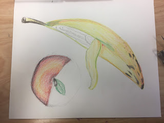
Originally, I was planning on doing the Nature vs. Mechanical project, with just like fruits that were cut open so you could see cogs and stuff inside of them? But they would be placed on a table, or in a normal setting near a fruit bowl, so you would assume that this was some sort of alternative reality where it was completely acceptable to have mechanical fruit.  I guess I was going for more of an absurdist thing.
    So, I drew out my apple and my banana--they're water color pencil--and then I drew the cogs and gears in pen, and then I painted them with water. They came out looking fantastic, and I was really proud of myself, so I started on the marbled granite of my counter using oil pastels.  Honestly, it looked terrible, and I was really disappointed. 


       So, I did what any normal person would do and I cut the pieces of fruit out individually.  As you can see here.  Now that I had the individual fruits, though, I needed a background to put them on.  I had already planned on doing the map project after I was finished with this one, so I decided that I would just combine the ideas.
      I had a better plan for the map project than the nature vs. mechanical project, so I continued on with that theme, which was road trip.  I know that that was a pretty stereotypical idea for a map, but I was going to do a monster road trip. So, I sort of incorporated that into this piece.
      The map that I chose was of Manhattan and the surrounding boroughs.  Ms. Rossi said that she liked the little newspaper and pen monsters I'd put in the water, so I decided to really amp it up and make the piece about monsters attacking New York City? And this was just someone's plan to get out. So, I drew escape routes directly onto the map, wrote a list of things that you would need to do if you were escaping the city, and sponged holes into the paper itself, and glued monsters coming out of it.  On top of all that, I added my banana and my apple because I thought that they fit the idea well. Sort of a steampunk atmosphere and also the color scheme went well together.
     Whenever I make collages, I'm thinking of creating more of a story that I do when I'm making another sort of art.  The combination of different objects from different locations lends itself more to storytelling for me.  So, the idea behind this is that someone is quickly leaving their home, and they have fruits that are lying on top of their map.  Fruits and a bunch of other stuff that they'll need, as well as representations of their future and what's going on around them. So the piece is a still life of a moment in time.  It's not a very cohesive idea, I know, but I love it a lot.  
     The note in the middle of the page was one that I found in the book of maps, and it's handwritten by my uncle. It's directions to somewhere, so that is the coolest piece of this collage.
This is a planning stage. 

This is probably my third or forth stage. I hadn't even glued the banana down yet, or glued down and
torn off a thing of white tissue paper.  
This is the final! 
     I don't know if you can tell, but there's a monster crawling out of the map by the banana, and then there are a bunch of cut out letters that say 'avoid water' like a ransom note in the middle. The picture on the bottom is of my mom's car with a bunch of luggage on top booking it down the highway. And the gears in the top left and bottom right corners are yellow, to keep the banana from standing out so much.  I definitely could put more stuff on top of all this, but I don't want to obscure any of these details, because I'm so attached to them (that's a problem I have with collages, I think), and I wouldn't know what else to put.