Tuesday, October 25, 2016

Self Portrait

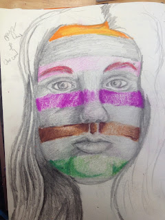
So, I forgot to take in progress pictures for this, which is really bad of me, I know.  In my defense, though, I drew this really quickly so taking day 1, day 2 photos wouldn't have really mattered.
     I know people look at this and think of "A Bad Case of the Stripes," but I really didn't mean to copy that idea.  This project was introduced on the day that I was sick, and I came in the next morning and came up with this idea and the reference photo in time for inspection.
     Directly below, you can see my planning piece for this portrait. Um. I don't know what happened, I really don't.  I thought it was a good picture when I first drew it, and as you can tell I played with the ideas of having different colored stripes throughout my face instead of just one solid color each time.  I also had the idea of not doing just random colors for each stripe, but a rainbow gradient down my face.
      I really have no idea how I can copy the same pictures twice and end up with such drastically different results each time.  Anyways. I really like the brown stripe under the nose in this one, it looks good enough to be part of the final.  
       I do appreciate the effect the orange had overall, though?  Sometimes I look at it and I feel like it's Halloween, which it is, but not Halloween in a good way. Or, like, an old timey prison jumpsuit, but with orange instead of white?  Overall, though, I like the orange.  I like the way that I've blended it with red and purple and yellow.  It makes me really confident about using prismas again.
      I wish I had used a little more expression in the face and given myself more of a challenge, but that's what my concentration's for, right?  I like my shading and composition, and how I used color.  I really like the fade out in the background, with the intensity of color fading out into the light blue, which is sort of the reverse of what's happening into the face.  I think that the texture in the hair really makes the picture that much better.  And I am so happy that I redid the eyes over again, because they look really great.
     If I could change anything, I would make everything just a bit smoother. The shading, specifically.  Again, I would change the expression of the face to give the drawing more complexity.  I also don't know that it looks like me? But I always make my face longer when I'm trying to fill up a page, so that's nothing new.  I would darken some shadows now that I'm staring at it, and would probably go back in with the lights if I had a chance, but I really like this piece and am glad that I had the chance to create it.

Ms. Sudkamp told me that it's been really nice seeing how my art has matured since art 1, and I agree.  It's really refreshing to be able to look at this compared to, like:
It makes me really proud of what I have been able to accomplish so far, even if it isn't all that spectacular in the grand scheme of things.  
Monday, October 17, 2016

Interior Space

This was my reference picture. 

This was after my first day of working on my final. 


This piece was also really enjoyable for me to work on. I wasn't fighting the medium, or struggling to express my ideas. The composition was enjoyable for me to work with, and I feel like the colors all worked together.
        It was really fun to paint with water colors and gouache. Though the paint I had was actually gouache, I sort of used it as water color for a different texture.  I thought that gave it a certain feel that just doing one or the other wouldn't have. Outlining in pen also added an element that just color wouldn't have.  I think Morgan was right in saying that it looked whimsical.
      I know that we're in Art 4 to make serious art that will eventually be judged by college professionals, but I think at this point in the semester I have to realize that I am not artistically on par with the rest of the class in a lot of mediums. I enjoy making art very much, but I never plan on it becoming my livelihood, or utilizing my skills beyond enjoyment.  Obviously, I would love to improve.  But overall, I think that I would like to like making art more. These past two pieces have been very frustrating to me, and I haven't liked the process of making them at all.
      This project, though, made me remember why I love making art. The simplicity of the colors and the shapes, and how they all came together in the end, was fun. And I know that it doesn't look a lot like the reference picture, and that factually it is a very poor representation of my interior space, but I think that stylistically it is an accomplishment.

This was my initial trial run, and as you can see,
I did this without a reference picture.
I've made notes on how to improve it on the picture itself.

This is my final project. I really like it, and I think the
posters in the back provide an interesting contrast,
because they aren't super detailed, but
they are very colorful.  

Sunday, October 16, 2016

Inktober

This is a bit late, but here's my inktober monster!

This is my fellow. As you can see, he is walking by the milliner's, and he is upset because he does not have a hat.  I think this turned out really well, especially the shadows.  Eventually, the top will get smoother because it will be touches a lot and worn down, and that's the only real problem I have with the piece. Also, I wish the windows were a little different.  I tried to use some white charcoal to indicate the difference, but I don't know how well it turned out.  
    I love working with charcoal. The contrast with ink in this was very interesting, I think.  For a small sketch the piece was a lot of fun to work on, and hopefully I can do something like this again soon.  

Tuesday, October 4, 2016

Oil: Everyday Object

This project, man.  We were supposed to choose a bunch of everyday objects and paint them with oils. Again, I wasn't super enthused with my idea, and I didn't dive into it with elbow grease and all that.  I didn't feel that soul-rending passion that I enjoy from the beginning of a project.  But, I did it. I'm not finished, I'm going to go back and touch some things up and add some shadows and also some copper design or whatever behind so that it will match the mermaid. I have a plan.
      I really hate presenting my painting to the classroom? Because everyone else has these masterful works, and then there's me, and it's amateur hour.  Get ready to suffer, Emma! I touched my oils when they were wet because I was painting on the floor between the dining room and the front hall.  And because I'm impatient and always have paint all over my hands. So I have to go over and do that.  Also, I was painting with minimal light so the colors look all wrong and just--ugh.  I dislike it very much.
    I mean, I like the basis of the painting. I think I have a solid foundation, and was even able to pull some of that off. I really like Charley, the skull.  Mercifin, the dragon, and the mermaid, are a little more abstract, but that's because I didn't have the control I needed to make them more realistic. I didn't like how little I could manipulate the oils.  Also, I painted shadows where there shouldn't have been shadows between the books, and it was hard to rectify my mistakes. The whole time I was painting this I felt like I was swimming and just barely keeping my head above water.
      I should have done a grouping of objects that appealed to me more, or at least something with a set background that I wasn't making up as I went along. Or, not used blue as my shadows. That's something I learned in drawing, but I really dislike it. Like, it's good in theory, but it takes away from the actual blue.  And if no other colors are distorted, it makes you question what you're really looking at.  But, at the same time, black is such an overpowering color.
      Also, I tried to be clever with the color? At the bottom of the painting, Charley is warm browns and yellows, and then we have the The Dream Thieves, which is red, and the table cloth, which is yellow. Moving up we have Blue Lily, Lily Blue which has a green jacket, the mermaid's tale, and then the hypothetical green fixture in the background. At the top I wanted to group Mercifin, The Raven King, and then the rest of the blue background together. Maybe I'll make like the stack of books and table that they're on are right up against the wall and add shadows to the background along with the fixture, to keep it from being so static.
     What we can surmise from this project is that I dislike waiting as much as I ever have, and that I am just as bad with color as I am when we started out.  I will get around to fixing the painting, but I don't think it will ever be as good as I hoped it would.

My reference photo.

First step.
Second step.  I added in Charley and Mercifin
on like the third day. 
This I think, would be a picture of my work on the
fourth day.
And this is not the final picture, but was taken before I
smudged everything!


This is probably from the sixth day i worked on it.


Not the best photo, but another one will be posted
shortly, after I finish touching up some stuff! 

Monday, October 3, 2016

Mentor/Mentee: First Visit

My Mentee is Joseph, who is really an incredible artist.  He does not want to continue in art, and is taking it only for the credit, but I really think he should continue.  Looking at his blog, at least, I think this his blog and I didn't mishear him, I am impressed with his knowledge of shape.  He is far more advanced than I was when I was in Art 1, but I understand if he doesn't want to continue.
      I really like his two-in-one project, I think it's very clever. And his charcoal project is very nice.  Obviously, he knows which mediums are the best already.


http://joseph-apex-2019.weebly.com/art-1