Tuesday, December 6, 2016

Landscape

So, surprise surprise, I don't have final pictures for my landscape drawing. And, surprise surprise, I don't think it's that great. But, let's talk about it, shall we?
First rough draft 

Rough draft with brown chalk pencil 

Beginning of final 

Day like 3 of final 


Day 4 of final 


In my defense, this piece of paper is like, two feet by a 18 inches. Which is a tremendous amount of space to work with. Also, I didn't really know what I was doing with foliage, as is probably obvious.
    The media for this is white and black charcoal with chalk pastel pencils on brown colored paper, in case you were wondering.
   What I wanted was for the brown of the paper to be the middle tone, and for the white charcoal to demarcate highlights.  Of course, the color range was eventually expanded because the amount of depth I would be able to get out of those to components was questionable, so two different shades of brown and black were added, as was gray.
    I think I made two big mistakes. The first being the black in the foliage. It's much too overpowering, and really detracts from the entire scene.  Possibly, I should have left out black all together. Secondly, I forgot that there were actual places where you could see the sky, and so had to color those the lightest possible color, white, which really threw the highlights of the trees out of whack.
     To top it all off, using the paper as a medium value left a lot of blank spaces on the paper, without any real depth. I'm going to have to revisit this piece and figure out how to make it more cohesive and how to give it more depth before submitting my final.

Monday, November 28, 2016

Animal Portrait

Original sketch
More sketches 

Some more sketches, looking at shading and
head shapes
For my animal portrait, I decided to draw my three pet mice. The white one is named Cassie, the black one that she's sitting on is Sammy, and the brown one who eats too much is Dean.  I used prisma colors in this piece, obviously, even after swearing that I would never so much as look at prisma colors ever again for the rest of my life.  And it was actually a lot of fun. I used some layering techniques that I had never considered before, which are especially prominent in Cas's fur.  I also layered a lot on the wheel and its shading.  
     I think this project was successful for me because I paid attention to my technique, and it was large and complex enough to hold my interest for a long amount of time. I think five days? There are some things that I don't like about it, but overall, I think it turned out really well and is most definitely one of my better pieces this semester. 
     I appreciate the warm undertones that the red paper gave my mice, but they are not under a red light?  I just really like the color red for prisma colors. So, since changing the technique that gives a lot of this piece its individualism, I would change the paper in the background to a brown or orange.  Yellow might not have gone so well with the blue.  I would also have liked to look at Dean's proportions a little more; I don't know what I can do now, but she still looks a little cartoonish to me.  Of course, I might want to make not to use more unrealistic colors all over the picture in the future, so I don't have just one section that stands out as really miscolored, but I don't think the effect is too terrible here. 
     I really appreciated working on this drawing, and it had given me new understanding of prisma colors.  Though there were things that I would change, this picture definitely has its strengths.  I will post the final soon.

Final, day 2
Final, day 1

Final, day 2.2

Final, day 3

Final, day 3.2

Close and personal with Final, day 4
Final, day 5

Final, day please let this stop

Final, almost done! 

Tuesday, October 25, 2016

Self Portrait

So, I forgot to take in progress pictures for this, which is really bad of me, I know.  In my defense, though, I drew this really quickly so taking day 1, day 2 photos wouldn't have really mattered.
     I know people look at this and think of "A Bad Case of the Stripes," but I really didn't mean to copy that idea.  This project was introduced on the day that I was sick, and I came in the next morning and came up with this idea and the reference photo in time for inspection.
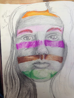
     Directly below, you can see my planning piece for this portrait. Um. I don't know what happened, I really don't.  I thought it was a good picture when I first drew it, and as you can tell I played with the ideas of having different colored stripes throughout my face instead of just one solid color each time.  I also had the idea of not doing just random colors for each stripe, but a rainbow gradient down my face.
      I really have no idea how I can copy the same pictures twice and end up with such drastically different results each time.  Anyways. I really like the brown stripe under the nose in this one, it looks good enough to be part of the final.  
       I do appreciate the effect the orange had overall, though?  Sometimes I look at it and I feel like it's Halloween, which it is, but not Halloween in a good way. Or, like, an old timey prison jumpsuit, but with orange instead of white?  Overall, though, I like the orange.  I like the way that I've blended it with red and purple and yellow.  It makes me really confident about using prismas again.
      I wish I had used a little more expression in the face and given myself more of a challenge, but that's what my concentration's for, right?  I like my shading and composition, and how I used color.  I really like the fade out in the background, with the intensity of color fading out into the light blue, which is sort of the reverse of what's happening into the face.  I think that the texture in the hair really makes the picture that much better.  And I am so happy that I redid the eyes over again, because they look really great.
     If I could change anything, I would make everything just a bit smoother. The shading, specifically.  Again, I would change the expression of the face to give the drawing more complexity.  I also don't know that it looks like me? But I always make my face longer when I'm trying to fill up a page, so that's nothing new.  I would darken some shadows now that I'm staring at it, and would probably go back in with the lights if I had a chance, but I really like this piece and am glad that I had the chance to create it.

Ms. Sudkamp told me that it's been really nice seeing how my art has matured since art 1, and I agree.  It's really refreshing to be able to look at this compared to, like:
It makes me really proud of what I have been able to accomplish so far, even if it isn't all that spectacular in the grand scheme of things.  

Monday, October 17, 2016

Interior Space

This was my reference picture. 

This was after my first day of working on my final. 


This piece was also really enjoyable for me to work on. I wasn't fighting the medium, or struggling to express my ideas. The composition was enjoyable for me to work with, and I feel like the colors all worked together.
        It was really fun to paint with water colors and gouache. Though the paint I had was actually gouache, I sort of used it as water color for a different texture.  I thought that gave it a certain feel that just doing one or the other wouldn't have. Outlining in pen also added an element that just color wouldn't have.  I think Morgan was right in saying that it looked whimsical.
      I know that we're in Art 4 to make serious art that will eventually be judged by college professionals, but I think at this point in the semester I have to realize that I am not artistically on par with the rest of the class in a lot of mediums. I enjoy making art very much, but I never plan on it becoming my livelihood, or utilizing my skills beyond enjoyment.  Obviously, I would love to improve.  But overall, I think that I would like to like making art more. These past two pieces have been very frustrating to me, and I haven't liked the process of making them at all.
      This project, though, made me remember why I love making art. The simplicity of the colors and the shapes, and how they all came together in the end, was fun. And I know that it doesn't look a lot like the reference picture, and that factually it is a very poor representation of my interior space, but I think that stylistically it is an accomplishment.

This was my initial trial run, and as you can see,
I did this without a reference picture.
I've made notes on how to improve it on the picture itself.

This is my final project. I really like it, and I think the
posters in the back provide an interesting contrast,
because they aren't super detailed, but
they are very colorful.  

Sunday, October 16, 2016

Inktober

This is a bit late, but here's my inktober monster!

This is my fellow. As you can see, he is walking by the milliner's, and he is upset because he does not have a hat.  I think this turned out really well, especially the shadows.  Eventually, the top will get smoother because it will be touches a lot and worn down, and that's the only real problem I have with the piece. Also, I wish the windows were a little different.  I tried to use some white charcoal to indicate the difference, but I don't know how well it turned out.  
    I love working with charcoal. The contrast with ink in this was very interesting, I think.  For a small sketch the piece was a lot of fun to work on, and hopefully I can do something like this again soon.  

Tuesday, October 4, 2016

Oil: Everyday Object

This project, man.  We were supposed to choose a bunch of everyday objects and paint them with oils. Again, I wasn't super enthused with my idea, and I didn't dive into it with elbow grease and all that.  I didn't feel that soul-rending passion that I enjoy from the beginning of a project.  But, I did it. I'm not finished, I'm going to go back and touch some things up and add some shadows and also some copper design or whatever behind so that it will match the mermaid. I have a plan.
      I really hate presenting my painting to the classroom? Because everyone else has these masterful works, and then there's me, and it's amateur hour.  Get ready to suffer, Emma! I touched my oils when they were wet because I was painting on the floor between the dining room and the front hall.  And because I'm impatient and always have paint all over my hands. So I have to go over and do that.  Also, I was painting with minimal light so the colors look all wrong and just--ugh.  I dislike it very much.
    I mean, I like the basis of the painting. I think I have a solid foundation, and was even able to pull some of that off. I really like Charley, the skull.  Mercifin, the dragon, and the mermaid, are a little more abstract, but that's because I didn't have the control I needed to make them more realistic. I didn't like how little I could manipulate the oils.  Also, I painted shadows where there shouldn't have been shadows between the books, and it was hard to rectify my mistakes. The whole time I was painting this I felt like I was swimming and just barely keeping my head above water.
      I should have done a grouping of objects that appealed to me more, or at least something with a set background that I wasn't making up as I went along. Or, not used blue as my shadows. That's something I learned in drawing, but I really dislike it. Like, it's good in theory, but it takes away from the actual blue.  And if no other colors are distorted, it makes you question what you're really looking at.  But, at the same time, black is such an overpowering color.
      Also, I tried to be clever with the color? At the bottom of the painting, Charley is warm browns and yellows, and then we have the The Dream Thieves, which is red, and the table cloth, which is yellow. Moving up we have Blue Lily, Lily Blue which has a green jacket, the mermaid's tale, and then the hypothetical green fixture in the background. At the top I wanted to group Mercifin, The Raven King, and then the rest of the blue background together. Maybe I'll make like the stack of books and table that they're on are right up against the wall and add shadows to the background along with the fixture, to keep it from being so static.
     What we can surmise from this project is that I dislike waiting as much as I ever have, and that I am just as bad with color as I am when we started out.  I will get around to fixing the painting, but I don't think it will ever be as good as I hoped it would.

My reference photo.

First step.
Second step.  I added in Charley and Mercifin
on like the third day. 
This I think, would be a picture of my work on the
fourth day.
And this is not the final picture, but was taken before I
smudged everything!


This is probably from the sixth day i worked on it.


Not the best photo, but another one will be posted
shortly, after I finish touching up some stuff! 

Monday, October 3, 2016

Mentor/Mentee: First Visit

My Mentee is Joseph, who is really an incredible artist.  He does not want to continue in art, and is taking it only for the credit, but I really think he should continue.  Looking at his blog, at least, I think this his blog and I didn't mishear him, I am impressed with his knowledge of shape.  He is far more advanced than I was when I was in Art 1, but I understand if he doesn't want to continue.
      I really like his two-in-one project, I think it's very clever. And his charcoal project is very nice.  Obviously, he knows which mediums are the best already.


http://joseph-apex-2019.weebly.com/art-1

Monday, September 19, 2016

Oil: Apples!

I loved painting these so much!  It was a lot of fun to play with the shadows and lights, and I loved how the paints blended together so smoothly.
    In the apple I did by traditional methods--paintbrush--the colors blended together wonderfully.  I had a couple panic attacks as I worked, freaking out that I had added too much paint of the wrong color, or too many highlights, or highlights that were too weird, but I think it came together very nicely, and I am happy that I have it.
    I absolutely hated doing the palette knife painting while I was doing it.  I wiped my pink covered palette knife on the leaf, actually, because I was just done with the whole thing. I couldn't control the knife, and I felt like I was using too much paint and wasn't staying within the lines, but once I gave up worrying about that, it was really enjoyable.  And when I took a step back to look at the finished product, I was overwhelmed by the fact that I had painted such a beautiful thing.

This was done with a paintbrush!
This was done with  a palette knife 

Reflection: Final project

I dislike this picture so much.  a) I hate prisma colors. Either that, or I don't really understand what I'm doing with them.  b) I dislike how I drew this picture.  Let's get started.
This was my reference picture.

In progress photo, day 1

In progress photo, day 2

In progress photo, day 3

Final product


I tried very hard to layer my colors and build up the prismas, but I don't think that I was too successful at it, which is a big problem with this piece.  I also think that I didn't do too well at choosing my colors for the color scheme.  I think I chose fairly dully colors and a fairly dull background to work on, which didn't do anything to exhibit how saturated the prisma colors can be.  I also feel that while my piece came from an interesting idea, the composition was lackluster and unappealing.
      The thought behind this piece, how this artwork is a reflection of me, is that I love to write.  The original picture is of me, writing in my journal, with the words of my journal reflected in my bracelet. I have a couple thick, band-bracelets that I wear fairly commonly, and so that was another insight into  me and my life.
     To improve this piece, I think that I would improve my prismacolor technique, change the colors that I used, and try to go a lot slower.  That is a reoccurring problem from me that everyone is probably sick of hearing about, I know, but I am very anxious to finish things when I really should be slowing down and concentrating on the minutia of my piece.  

Tuesday, May 31, 2016

Scratch That, Reverse It: Scratchboard Final

1.  Describe the subject matter and the meaning of your work.
      The subject matter is more of my same magical realism theme, I guess.  It's a girl with wings, trying not to be blown away by the wind as it pushes her umbrella upwards.  I guess a girl with wings would have very light bones, so it might be a danger that she would be blown away.  I don't know if I drew this with a true meaning in mind. I just was thinking one day, and I saw that picture, and I wanted to draw it.

2. How did you use texture to enhance your picture?
     I think I used texture to show the tension in her wings as the wind pushes them along.  Feathers wouldn't be the same without texture, I don't think.  And the water was greatly enhanced by texture, though I don't really know why that was there.  I think that the texture was one of the main points of the composition, because without it, the picture would have seemed very bland.

3. How did you balance your artwork and create a well-organized composition?
     I think that I created a well-organized composition through texture.  Also, the balance between motion of negative space and objects was very well balanced, thanks to Ms. Rossi's input.  The added feathers added a lot to the composition, and make the piece look a lot more spontaneous.  Looking at it now, I really regret the water.  Or, at least, the line that separates the water from the rest of the piece.  I sort of drew that line thinking that it would be the basis for a sidewalk, and then I misplaced the puddle, so now it's a pool, but I really regret that whole bottom third.


4. How did you imply movement in your drawing?
     I think I imply movement with the wind and the feathers blowing everywhere.  And I think the girl's basic position implies movement, because she's reaching up to pull the umbrella back down to her.  Her limbs and her hair all suggest movement to me, as does the position of her head relative to the rest of her body.

5. How could you improve your artwork?
    I could not have that bunch of water in the bottom.  I think that would make everything look at lot better. Also, I think that because this was my first scratchboard I was very inexperienced in the medium, so I made a lot of amateur mistakes.  The wings don't look all that great, upon greater inspection, and some of the lines go in funky directions.  Seeing what some of my classmates did with their scratchboards made me reconsider my skills.

6.  How did you demonstrate a wide range of shading values?
      I think I demonstrated a fairly wide ranged of shading values through the water, and the wings and the girl's clothing, especially.  I tried to make the brights as bright as they could go, and keep the darks as implied as possible, but I found that very difficult because, again, I didn't plan as well as I should have, and I didn't really know what I was doing. Also, I found it hard to take away the lights, as I've mentioned before, and so I accidentally wound up taking some of the darks off instead.  I think that if I redid this scratchboard, I would have a better understanding of what I was doing, and would consequently have a better range of shading and values.

Sunday, May 15, 2016

Face Me: Final


Describe:
     So, my idea for this was that I would be slowly turning into a zombie as flora took over my body.  I hoped to show pain, by my facial expression, because I imagine it would be a painful process.  The drew the face in charcoal, with white charcoal highlights, and the flowers and plants were colored in prismas.  The paper I drew it on is a brown construction paper.

Analyze:
   I would say that this work isn't as well drawn as I would have liked it to be.  I do think that it is a good drawing, possibly one of my best, but I also really appreciate the sketch drawings more.  I think the size of the paper threw me off.  I was used to working on a less stretched out paper, so when I moved to a longer paper, the proportions became maligned.  I don't think it looks a lot like me, which is sort of disappointing, but I feel like I pulled everything else off successfully enough.
    I really enjoyed the effect the white charcoal had on the body.  It draws the eye away from the brightness of the flowers to the darker side of the face, which I feel is really important, because both sides are of equal gravity to the piece in its entirety.

Interpret:
   I got the idea for this piece from my fascination of flora and the uses for different sort of flowers.  I think that in this drawing, I've included juniper, evergreen, lichen, hydrangea, violets, Indian's paintbrush, and a rose.  Some of these I've added for specific reasons, and I think that I put the color in to also make the same point.  The color, to me, represents the beauty of nature, vs. how humans destroy the environment. But, in this drawing, the nature is the one destroying the human.  Event though it's beautiful, it still has the potential to destroy.  Maybe this just me being dramatic, but I think that the color detracts from this message, which makes it even cooler to me still.

Judge:
    I think that the effect of the drawing, over all, was very good.  Thought it didn't happen how I wanted it to, I do think that I executed it well.  I don't know what happened to the right side of my hair, I really should have darkened that up, but I think that is the weakest part of the entire drawing.  Overall, I am very proud of this. I think that I was able to use a lot of the skill I've been building up over the semester, and I demonstrated my ability to use both charcoal and prismas effectively.

Face Me: Concepts for the Final

So, we had three concepts we could choose from for our portraits: mechanical, expressive, or zombified.

Mechanical:
    For this concept I thought that I would do a smooth metal face, with seams around all the major shadows, with each shadow group being represented in a different metal color.


Expressive: 
    This was a relatively simplistic idea.  I was just going to draw me being really upset, but I was going to do it in monochromatic red. 


Monster: 
     I just did this one, because I thought it would be a cool idea.  It didn't really come out how I wanted it to, so you know.  It looks really, really strange, so I'm glad I didn't choose do to this one.  I sort of wanted the left side of the face to turn into a snout?  But the perspective would have been difficult. 

Zombified: 
     I saw this image, or an image like this, the moment the project was announced.  It's sort of a flower zombie.  And it's also expressive, because I would be screaming as I was turning into a zombie.  Because I imagine having flowers growing out of your mouth to be very painful. 

Concept
Initial planning


Final sketch

Sunday, April 24, 2016

Face Me: Orifices and Miscellaneous (and Face)


All of my face pieces and the final face!  I don't think I did my hair so well, but I'll do better next time.  And my nose looks so weird but that's probably my face, and not my drawing.